Concept Personnel
Click on the link above to have a look at local recruitment agency Concept Personnel's blog on "How to make your internship a success". This is a very helpful piece for whether you are applying for a placement, internship or even starting a new job. The top 3 tips I think from this blog are:
Show Enthusiasm - You should look like this is a job that you're interested in and want to learn about.
Be Proactive - Show that you are keen to do as much work as possible, don't sit around and play on the internet when you've finished your task. Ask for feedback or if there is another task you can start.
Ask Questions - Try to learn as much as possible while you are there, it will help you understand how businesses work and will help you in future jobs. Also ask about the work you are doing and for feedback, you won't improve if you don't.
Wednesday 27 April 2011
Monday 18 April 2011
Room 501 placement
So on Friday I finished my 2 week placement at Room 501 Publishing in Sunderland. Room 501 are predominantly a magazine publishers that have around 5 magazines (Business Quarter, Food Quarter, Luxe, NARC. and Hitched). All of the magazines focus on a different subject and each has a very different style of design so when working from one to another it keeps things fresh and it doesn't get tedious. They also work on book designs, web design and branding. There is only 4 designers that work there along with a larger sales team, this keeps it friendly and I found it a great environment to work in as not everyone was working on the same things.
On my first week there it was all about learning about the styles of each magazine so I spent some time putting arranging past articles to how I think they would best fit and once finished comparing them to how they were finally published. I also worked on a design for an annual report for a client that was sent along with another idea for the client to look at. During the second week I worked on some spreads for BQ Magazine (Business Quarter) for their Spring issue that will be printed within a few weeks so I will put some pics up once I get my copy.
I really enjoyed my two weeks there and they flew by so fast. I learnt alot about attention to detail and how each magazine has their own personality. It was great to work with some professional photography and live articles and to get some real experience in editorial. Before this placement I loved editorial design but wasn't sure if I would actually enjoy doing it as a job, and after being here I know it's something I really want to go into. They were really impressed with my work at Room 501 and said that if they had a job available they would offer me one, unfortunately they don't have any jobs available but i'll definitely keep in contact with them and you never know what will happen in the future.
Logorama
Logorama from Marc Altshuler - Human Music on Vimeo.
This is a short animation that was directed by the French animation collective H5, Francois Alaux, Herve de Crecy and Ludovic Houplain. It was presented at the Cannes Film Festival 2009, it opened the 2010 Sundance Film Festival and won a 2010 academy award under the category of animated short.
How clever is this animation? I always knew Ronald McDonald was evil and who knew that so many recognisable logos could be combined together to create something like this? This must've taken forever just to think of what could be used for each element. I also think it says something about how modern culture revolves around branding and advertising. I wonder how many logos they actually used?
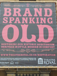
Theatre Royal
I love these typographic posters outside the Newcastle Theatre Royal, they have a vintage feel to them and the varying sizes in type works very well making certain words stand out more.


Tuesday 12 April 2011
NARC. magazine release
So remember a while ago when I said my work was going to be featured in Narc. Magazine, well it came out a week past Wednesday and here's some photos of the final magazine...


 |
| Stephen Ward from our class was the winner and designed the cover, cd and spreads inside |
 |
| There's my design bang in the middle with various other shortlisted entries |
London Trip (Part 2)
M&C Saatchi
After the Design Museum we headed over to advertising company M&C Saatchi. While we were there we got to look at a graduate graphic design portfolio of a recent employee. There was some good tips here on how best we should design our portfolio, there should be a strong grid structure and we should tackle it the same as we would a design project. You should have various example of work which will, in turn, boost your employability (it's a good selling point to be able to do both online and print design). It was very handy to see a portfolio of someone working in London at the stage it was when he graduated and landed the job as this is the stage we'll be at very soon!
Ziggurat Brands
Next stop was Ziggurat Brands, a packaging design studio. While we were here we got to see the process of developing a brand - Red Sky Crisps
How ideas are generated there wasn't so much different to how we work at college however it is at a much faster pace and more ideas are produced, which is something I need to work on. While we were there we got some helpful tips:
- Don't obsess over one idea style, show variety as you can never tell what the client wants
- Use references against rough ideas so the style of illustration/photography comes through more
- Moodboards!!! Help to narrow down ideas and gives them themes
- Normally present 6-10 ideas to a client, then refine them from the clients feedback and show how they can adapt to a range
- Make sure the final design reflects the brands ethos
- Don't forget about the consumer, find out what they want!
Hawaii is a design company that specialises in various areas of design including brand identity, art direction, interior design, exhibition design and illustration. Paul McAnelly (the face behind Hawaii) is very down to earth and like all of our visits gave us some great advice. Paul took an unusual route into graphic design by studying for a HND in Advertising and worked in that area for a bit before he decided to take his own route and set up Hawaii.
- His main advice for us was to get as many disciplines under your belt as possible, this was advice we heard alot throughout the trip and know your programs back to front!
- Do at least 2 directions before presenting to the client
- You get a better contrast when using 2 pantone swatches rather then black and white
- When designing logos it helps to have one element that can be used differently (animated etc.)
- Smaller paying jobs tend to drag on a bit more and be more of a pain, but it pays
- Small companies like Hawaii get jobs by word of mouth so all the little smaller paying jobs might lead to something better
- Think of how a logo will work on screen before print as this is the way things will eventually go
- Make sure your portfolio is presented well and use good stock, with a short description
- Don't be too negative about your own work, although this can be hard as no-one is the biggest fan of their own work
- Think out of the box and BE REMEMBERED!
Popular was our last visit of the week and has quite a similar set up to Hawaii as Peter Chadwick runs Popular single handedly. Peter's first point when talking to us was that you don't have to come to London to work in design, as other cities are establishing themselves in design, ie. Leeds, Manchester, Glasgow. I think this point is very valid as alot of people think that you have to go to London to make a name for yourself and that isn't the case anymore with emails and the internet it is alot easier to keep in contact with clients no matter where you are. Peter mainly works within the music industry as an art director for record covers, however he has recently branched out a bit and has worked on some editorial design which this is something he would like to do alot more of. Peter previously built up a studio called Zip Design to a team of 10 however he walked away and set up Popular as he felt he wasn't designing anymore. He works with alot of freelancers to create his artwork as this is more cost effective then hiring a team of staff that can work in various areas. He made a point of telling us that it is very important that you love where you work and what you do! And it is important to keep doing personal work, he is now working on a book called "Music to my eyes" which he is hoping to get published, so keep an eye out for it in the near future. Although Peter loves his own space he told us that it would be ideal to work as a pair, that way you can bounce ideas off each other and sometimes you can go a whole day on your own without seeing anyone so having someone else wouldn't make it as isolated. He also told us that although it is great doing work for your friends, don't be afraid to approach money and charge as once you start doing work for free or cheaper, where do you stop and you have to make a living out of what you do. You need to be confident using a Mac and all the programs you need (illustrator, indesign, photoshop etc.) When presenting say what your inspiration was and give details of your idea. Clients want to see a final piece before you have been given a job. Make yourself familiar with the grid system! And clients always like it if there is something behind the idea such as an art movement, and always plan for a series, even if they only ask for one.
Well that was our trip to London. All the advice we were given was very helpful and I will be taking all of it on board when creating my portfolio and applying for jobs.
Monday 4 April 2011
London Trip! (Part 1)
I spent most of last week in London with 4 others from my class and our tutor. It was so inspiring being in a different place and seeing how design companies work in the big city. All the advice we were given was very helpful and it is true what they say about portfolios being subjective as we were also given some very different advice aswell. So lets start with Monday...
Cosmopolitan is an international magazine and probably the most well known in Britain. I was really looking forward to this visit as I am very interested in Editorial Design (as you have probably guessed from previous posts) and hope to have a career at a magazine one day. One of the main problems with Editorial Design, as we found out at this visit, is that alot of magazine now are online or you can download as an app for you ipad/mac. However hopefully this shouldnt effect established magazines such as Cosmo too much. So here are the tips they gave us on creating a portfolio and getting that first job...
- Tell a story with your editorial layouts
- BE CONFIDENT! ( but not arrogant )
- Email asking for placements and if you don't get a reply follow up with a phone call, make sure you know the name of who you're contacting and don't spell it wrong!
- Apply for magazines you want to work for, there's no use working somewhere you don't want to be as you won't enjoy it
- While on placement make yourself indispensable, ie. make cups of tea, do what you're asked, don't be too over-the-top/annoying
- DON'T WASTE ANY OPPORTUNITIES
- Push yourself - if asked to do a layout do several versions
- Sometimes it's about being in the right place at the right time
- Stick to any guidelines you have been given and ask before making any changes
- Apply to as many placements as possible
- Exaggerate a little on knowledge - you need to know InDesign, Illustrator and Photoshop
- Keep the covering letter short and simple, with a one page cv attached and several examples of work
- Only put work on your cv that you are proud of and confident talking about. Make sure your personality comes through at an interview
- BE PASSIONATE!
- Take a sketchbook to interviews to show the thought process
- Know what to finish the interview, is the interviewer getting bored?
- Don't go into detail when talking through work, just the brief, your basic idea and about the final is all that is needed
- Take advice! - Don't take it to heart, it'll help you through your next interview
At the end of our talk at Cosmopolitan I asked if it would be alright to give them a disc with my portfolio on and to my surprise the next day I got an email from them asking if I can come for a 4 week placement in September, so London here I come!!! Watch this space! :)
On our second day in London we went with the Advertising students to visit...
Ogilvy
Oglivy is a worldwide advertising company with offices all over the world. The role of a graphic designer in an advertising company is more like an artworker as the copywriters tend to come up with the ideas and pass them onto the graphic designers to make them up. It was interesting to look round a huge company and how they work but I from my point of view it was too big and isn't particularly the sort of environment I would like to work in. However on a plus point we had a tour around their digital labs and it was amazing to see how advanced the ideas and technology is that they are working with...


Oglivy is a worldwide advertising company with offices all over the world. The role of a graphic designer in an advertising company is more like an artworker as the copywriters tend to come up with the ideas and pass them onto the graphic designers to make them up. It was interesting to look round a huge company and how they work but I from my point of view it was too big and isn't particularly the sort of environment I would like to work in. However on a plus point we had a tour around their digital labs and it was amazing to see how advanced the ideas and technology is that they are working with...
This is an image of an augmented reality program they have where if for example you hold up a flat photo of a car it creates a 3D model of it on screen, pretty nifty!
On the Wednesday morning we went to the Design Museum to see the Wim Crouwel: A Graphic Odyssey exhibition. Wim Crouwel is a Dutch designer considered one of the leading designers of the 20th Century. He produced typographic designs that captured the essence of the emerging computer and space age of the early 60's and his designs are still timeless today.


What I think is so amazing about Crouwel's work is that it looks very futuristic...even today. It has a quality that makes it timeless and is very inspirational. After looking at the exhibition I was full of all sorts of ideas to try throughout the summer.
While we were at the Design museum there was also an exhibition of the Brit Insurance Designers of the Year. There's some photos below of the pieces I found most interesting. ( I apologise for my photography skills )


Group Presentation
Last Thursday we had to do a group presentation at college, looking into various companies and designers. My group looked at regional companies:
Navy Blue
Navy Blue is a brand communications agency with offices based in Edinburgh, London, Muscat and Johannesburg. I quite like the clean, structured look to Navy Blue's website, however it is a bit hard to navigate and doesn't show their portfolio of work very clearly. Their logo is nice and simple which means the images stand out more and are the main focal point. They seem to take on various sized clients and don't stick to one particular style which works well as their client base is so varied.

The Chase
The Chase is a Manchester based studio set up in 1986, the now have an office in London and just recently opened a satellite office in Preston. They are a medium sized studio with 46 staff in total and offer a full range of services. They have worked for alot of big clients for example, Marks and Spencer, BBC, Yellow Pages, Fujitsu, Fox's Biscuits and Selfridges. The Chase have a very modern feel to their work but still keep it corporate enough that it can be successful. Their website is very clean and white, with a simple layout, making it very easy to navigate. Their work has a very contemporary look using alot of photography and illustration to keep it interesting to look at.

Elmwood
Elmwood is and international design business that started in 1977. They work across many disciplines with several areas of specialist knowledge and expertise. Elmwood has many big name clients including ASDA, BBC, Comic Relief, Durex, The FA and Royal Mail. Their website is very green! With all the objects you can see in the image below animated. For me this is far to busy and distracting and also can take a little while to load a new page. However despite the distractions the website is very simple to navigate, the work is very professional and you'll find it hard to find something on here that you haven't already seen in your daily life.

Dedass
Dedass was set up in 1991 making a creative agency that uses alot of illustration in its design. Their work has been seen in many magazines including, Wallpaper, Design Week, Computer Arts, Eye and Icon. Dedass' portfolio is very contemporary with unusual illustrations and a unique style. The website continues this contemporary feel however I initially find it distracting as theres so much to look at on one page, but you quickly get used to it, and despite this it is very easy to nagvigate. Alot of their work is print based pieces, mainly posters or exhibition work.

True North
True North was founded in 2001 in Manchester as an agency 'that creates design that is as effective as it is beautiful.' Alot of their clients are museums but they have also produced work for Adidas, bmi, Durham University and Royal Mail. Their work seems very corporate but with a twist to make it interesting and unique. The website is simple with drop down menus and full screen images. I think the full screen images are very effective as when you are looking through their portfolio it creates drama and impact.

I found this task very helpful and insightful especially as one of the groups had London companies and we went on a college trip to London the week after. We are also currently designing our own portfolio websites so this task was useful to be inspired by professional companies and designer's websites and see what works and what doesn't.
Subscribe to:
Posts (Atom)